You are using an out of date browser. It may not display this or other websites correctly.
You should upgrade or use an alternative browser.
You should upgrade or use an alternative browser.
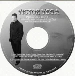
NEW CD Cover - What do you guys think?
- Thread starter victorvega
- Start date
🤖 AI Summary
No AI summary has been generated for this thread yet.
Y
yahaira
I like it Victor very nice
Kenny Guido
Well-known member
I like it! 🙂
mike4949
New member
Nice cover
Taz X.T.R.
New member
The full body shot should go. I like just the face on the cd, because it gives it a bit of mystery. Your whole shot there doesn't leave anything to the mind. Keep them guessing, give it to them in teaspoons.
Poor Rican
New member
- Joined
- Jun 5, 2002
- Messages
- 285
- Reaction score
- 0
- Points
- 0
From an artist stand point, get that text off your face definetly.Too arkward.Then lose the cd design , so keep it gray and lose the white corners.TRUST ME.Leave all the addition saying for the back of the cover or the inside booklet. Trust me your cover should be symbolic in all ways, not advertised in a distortion.Leave the text for the back of the cd, that is where it belongs. Wut else r ppl gonna see when the look on the bak? This is the point if you gonna have a chick have that same pic of you as a poster, she wants to see you. And if you want to go the route of being mysterious like tazxtr says, you should have just maybe covered your face a lil wit ya collar or something you get my drift.Keep the text off. You want to have simple symbolics artwise photo, like for instance I like the color. 1# .And then you have the Title(your name etc.)2
Then you have your overall image. So that's why you should get rid of the cd, and text idea. It breaks up your Image. Peece.
Then you have your overall image. So that's why you should get rid of the cd, and text idea. It breaks up your Image. Peece.
Poor Rican
New member
- Joined
- Jun 5, 2002
- Messages
- 285
- Reaction score
- 0
- Points
- 0
Hey you might want to have the Font color in white or black to stand more. Trust me, I know these things. The overall photo is fresh, it should be kept masterful.So show it.
EZE_2K3
New member
OFF DA GANCHO KID!!!
FreestyleChulo
New member
- Joined
- Sep 19, 2001
- Messages
- 1,755
- Reaction score
- 0
- Points
- 0
looks dope
ColombianHarry
New member
- Joined
- Feb 10, 2002
- Messages
- 4,188
- Reaction score
- 0
- Points
- 0
I like it
Rolando
New member
Victor, you're *Profilin* bro.
Big Time! 😛
Big Time! 😛
sexy mamma
New member
I like that u look very cute.
sExXxe
New member
HUBBA HUBBA LLLL.....MUAHZZZZZZZZZZZZZZZZZZZZZZ LOVE ITTTTTTTT!! HOWS FERNANDA
Liz_Torres
New member
Dayyyyyyyyyyyyymmm
u fyne-
I meant it's very nice!!! 😛
u fyne-
I meant it's very nice!!! 😛
victorvega
Performing / Recording Artist
This is what I think
I want to thank all of you for your suggestions and compliments. What I am thinking of doing is leaving it as is for the CD cover and the CD I may take off the full body shot. Thanks guys and gals, hope to see you guys soon,
Vic
I want to thank all of you for your suggestions and compliments. What I am thinking of doing is leaving it as is for the CD cover and the CD I may take off the full body shot. Thanks guys and gals, hope to see you guys soon,
Vic

