You are using an out of date browser. It may not display this or other websites correctly.
You should upgrade or use an alternative browser.
You should upgrade or use an alternative browser.
The flyer i created for school need an opinion
🤖 AI Summary
No AI summary has been generated for this thread yet.
Krystal
New member
Looks good Ed! 😉
myonlysweetie
New member
Awesome Ed! 🙂
J
JackG
You should be jailed for squishing the sacred CF Logo!
😛
😛
Liz_Torres
New member
lol Jack-
Ed it looks good...
Ed it looks good...
CoOl_AL_FrM_qNs
New member
- Joined
- May 13, 2003
- Messages
- 2,151
- Reaction score
- 1
- Points
- 0
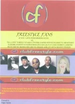
looks cool ed but if this is ur first flyer that u doin as a tryout im sure u can do better but if my web design teacher would of have seen this the first thing he/she would say is u need to fix the logo on top fix the the edges cuz it looks cheesy also u could of have put more pics of artists so that the purple background wont show as much u know? and the bottom with ur name u could of have spread it wide make it look more nice maybe with a graphic
Edalgiere
New member
Thanks guys the reason i posted it was for the feedback jack i restored the actual size of the logo
Edalgiere
New member
Edalgiere
New member

G_I_JOE_EMR
New member
- Joined
- Oct 13, 2003
- Messages
- 1,434
- Reaction score
- 1
- Points
- 0
- Location
- Freestyle, & Dance old & new school
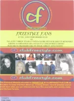
I like the lighter one. Nice job :fkinaman
Hope you get a good grade. :yeey
Hope you get a good grade. :yeey
Edalgiere
New member
the anya and manny pics i took at the wild palm show
colvs
New member
the 2nd lighter one is great Ed. Good luck on the project buddy. 😉
Steve
Steve
Shorty3869
New member
I like it !
J
JackG
Great Improvment!
JOEDOCPA
New member
- Joined
- Jan 3, 2001
- Messages
- 16,982
- Reaction score
- 2
- Points
- 0
- Location
- /sixers/ flyers/ phillies entourage
good Job ED
Liz_Torres
New member
too light and too dark- try somewhere in the middle.
EL_BORICUA_72
New member
- Joined
- Sep 8, 2002
- Messages
- 4,378
- Reaction score
- 0
- Points
- 0
Nice job Ed! They should be posted all over the country!!!!!!!!!!!!!!!!!
Vinss-T
Active member
ed - looks amazing :yeey i like the second-last one most.
Krystal
New member
2nd one is MUCH Better! Great job!
3rd one is too dark.
3rd one is too dark.